It’s been a while since I updated this blog! The past months (since about July…) have been super busy and have just flown! Without going into every detail of my life, this year has certainly been a wild ride!
That being said, I’ve been working on refining my own brand, so this website will look different in the coming few weeks!
“Branding” is such a buzz word right now, but much of the time I don’t think people really understand what it is they’re talking about. Sometimes people think a brand is synonymous with a logo, or they think it’s the website.
What is a brand?
It’s basically your business’/your identity, visually. It’s how people identify you, associate you and see you. Your brand gives you and your business IDENTITY and helps make first and lasting impressions. So it’s… a bit important. 😉 It’s kind of like a face and personality for your business.
Being a “branding designer” seems to be a bit of a trend nowadays; it’s something that people decide they design without really knowing what it entails.
It’s a big process.
So I thought I’d document my own process that is ever-evolving after formal education, experience, watching other designers and just experimenting.
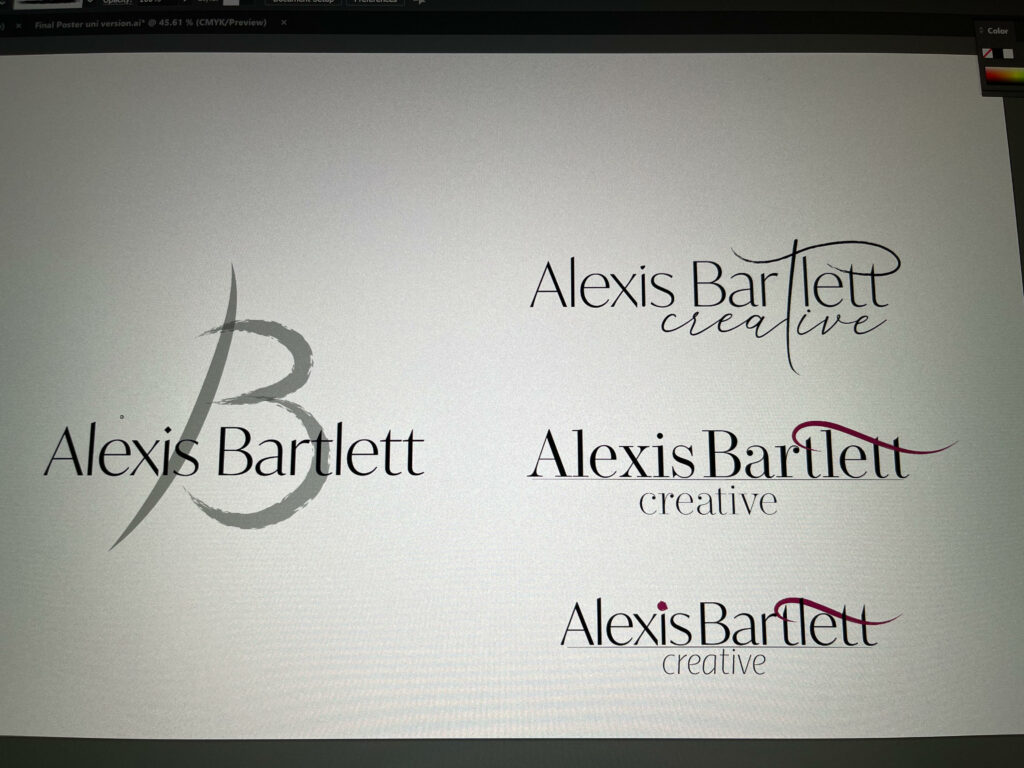
LOGOS. HAHA. What’s in a logo?! This topic deserves its own series of posts, but for the sake of this post, I generally start with a logo design because everything else sort of… goes with that. And designing my own has been harder than designing others’. I’ve found, anyway. I’ve designed myself multiple logos over the years and have never really been 100% happy, so I’m really taking my time here. Here are some rough ones that I’m working on/with.
I don’t really want to go into people’s misconceptions about what a logo is right now; I’ll save that for another day. 😉 But a logo does not have to be some cute or fancy image. A logo doesn’t need an image at all. Think about well known logos; think Sony, Google, Vogue etc.
Normally it’s good to start with sketching. I generally start most art with a sketch of some sort. As a very visual person, I like being able to see stuff, even if it just looks like scribble.
Here’s another thing people don’t really understand about logos: they need to work in black and white. A lot of times, logos are displayed in black and white. For whatever reason. So they need to work in black and white AND colour.
I used to not like designing logos. I enjoy them now, but years ago I hated them; I found them SO hard. I think the reason is that you need to fit so much into something so small. And again, I think that’s where people get muddled up. So often I see people designing “logos” that should act more as a full on illustration. Logos should be simple. I guess that’s why I find my own the most difficult: obviously I know more about myself than anyone else, so I have so many things that I feel I want to add into a logo: I’m an artist, but oh, I also like all these other things… maybe I should add those in! But I can’t! I think it’s about refining yourself and what you do so you can come away with something simple and easily read.

I mean… I’d love to include a ton of extra things about myself in a logo: my love of dance, books, writing, my family life etc. But… that would just be weird. LOL.
I’ve lost count of the no. of times I’ve seen/heard people say: “I just quickly made this!” or “I JUST need a logo”. Dude. No. Logos are works of art in their own right. They take SO MUCH LONGER than people think. Just because they look small and simple does not mean they don’t take as long – sometimes longer – than a full on painting or illustration. Doesn’t your business and brand image deserve more than a few seconds of effort?
But anyway, I’m indecisive with these things. But I currently have the four above that I’m sitting on. Feel free to let me know which you find more appealing. Maybe none?
I could go on and on about logos. I think a lot of people could; there’s a reason I’ve now studied this topic MULTIPLE times. There are a lot of opinions when it comes to logos, but generally: keep them simple. It’s hard. But they work better if they’re simple: they need to be seen in various sizes, formats, colours, and on different materials.
Once I finally decide on one, next up is a colour palette, fonts and maybe utilising a mood board. Ahh mood boards: another current fad. =P I find them so boring, but I guess sometimes they can be useful…
But I hope this was a somewhat helpful, quick insight. 🙂 This page may start looking a bit different in the immediate future!